About Project
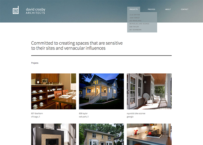
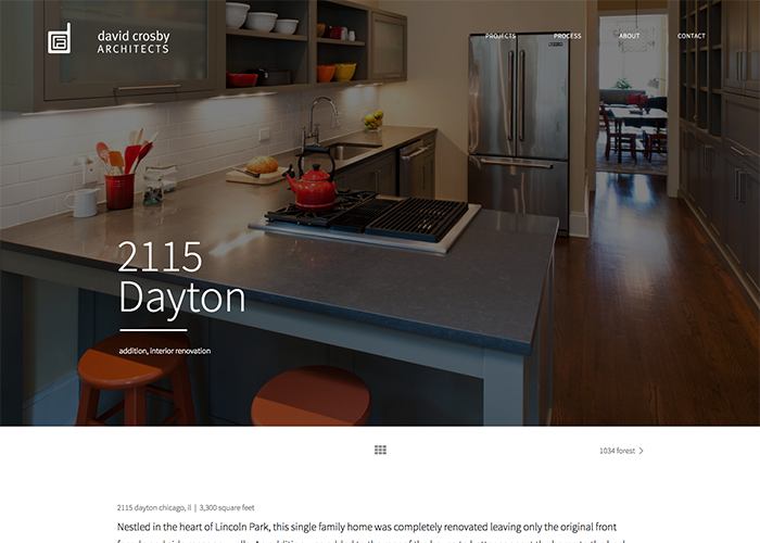
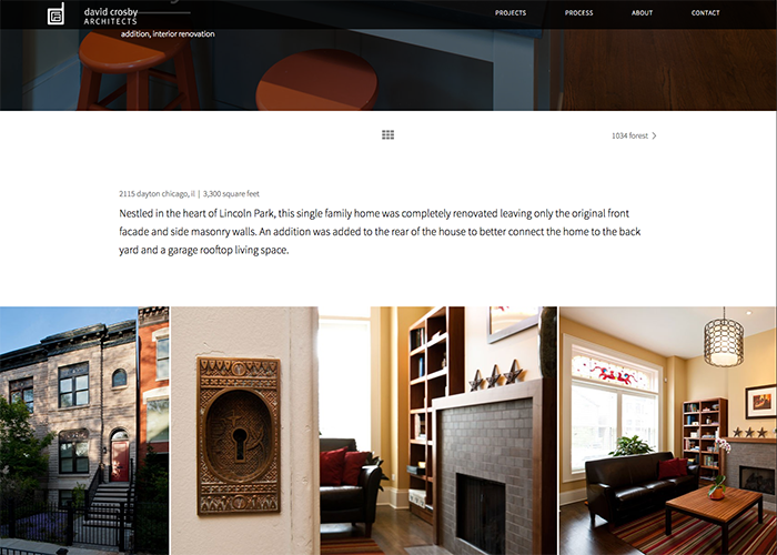
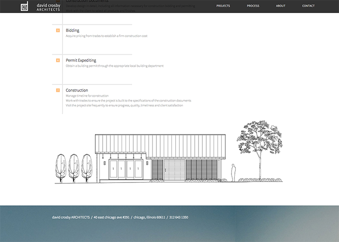
David Crosby Architects website was redesigned for a multi-platform/responsive online experience. David’s work is shown in a fresh, large-scale format, along with details to further convey his aesthetic and sense of taste. A rich and inviting feel is achieved through warm tones, woods, metals, stone, and modern styling. As an architect, the site needed to feel fresh, clean and minimal. The site needed to be perceived as smart, functional, inspired and clean. One large hero image is featured up top for each property – with multiple angles of space available for scrolling.

